Café Chokolade is a popular hangout joint and famous for it’s flagship product CAD B viz. and now known as CHOKOLADE B. Café Chokolade was started in Pune with a single outlet in 2007 and today has a total of 100 stores and counting in 36 cities of India!
Apart from the Chokolade B, Café Chokolade as the name states is a café that also serves a diverse range of other premium flavoured shakes, fruit shakes, desserts and yummy snacks catering to a young crowd making it one cool hangout joint.
BRAND IDENTITY:
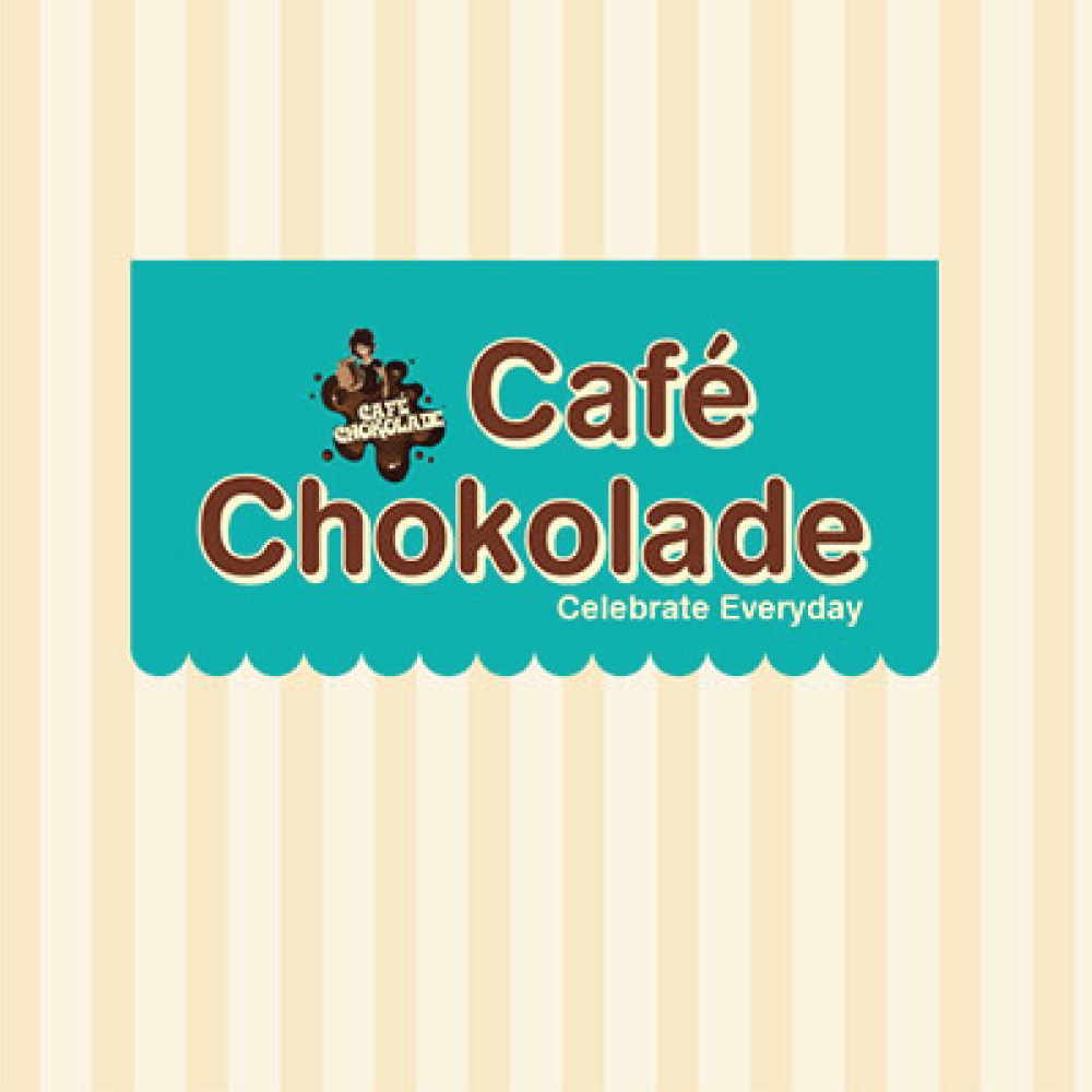
Before it’s major expansion, Cafe Chokolade originally had a very simple look and feel in their outlets. Their Logo was a Chocolate Splash and a cartoon image of a teenage boy holding the key product, Chokolade B. Their outlet too, had a lot of hues of brown colour. Due to this, the cafe communicated a chocolaty feel and misled people to think of it as a chocolate product store or a confectionery, whereas, it has a wide range of delicious varieties of desserts and snacks. Since Café Chokolade is the next cool hangout joint, it needs to be attractive looking with the right communication.
So we created a logo, wherein we made a turquoise colour awning conveying the thought of a café and an international look and feel and wrote the brand name in chocolate brown colour. We also retained the chocolate splash and image of the teenage boy holding the shake to keep the brand identity fixed and to avoid creating the confusion of change in people’s mind.
The combination of chocolate brown and turquoise is not only attractive and stylish but also indicates the brand’s personality.